Images
Put a photo in the page's folder and add it with one line. siv makes every size a screen needs, removes the camera's location data and adds a caption.
An image with a caption # ↑
Copy the image into the page's folder, next to index.md:
content/my-first-page/index.md
content/my-first-page/lake.jpg
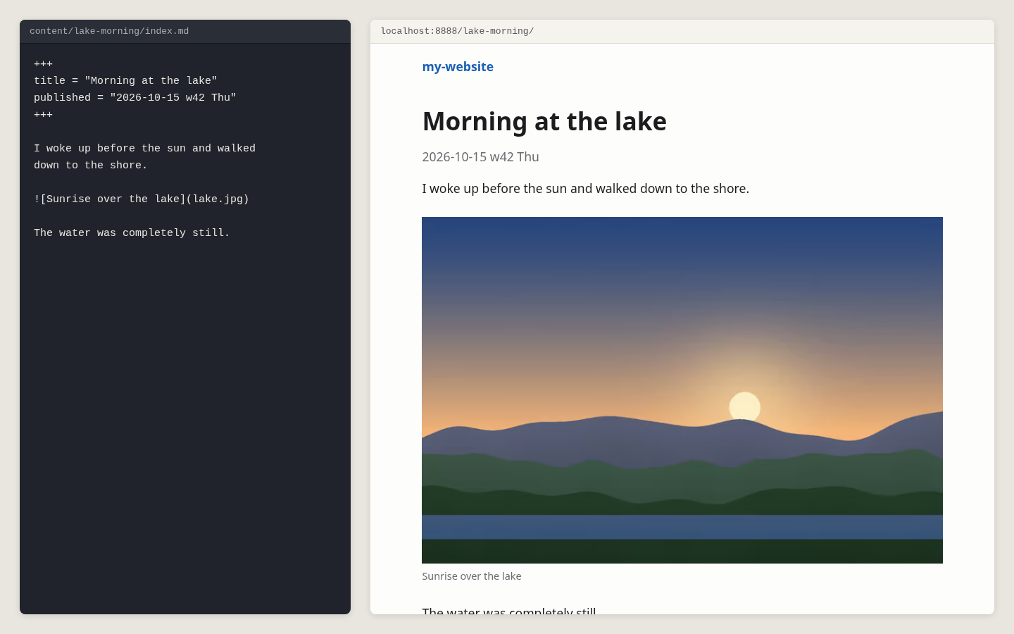
An image alone on its line becomes a figure. Its description is shown as the caption, and screen readers read it aloud:

Click the image to see it bigger. Press Esc, or click again, to close it:
Without a description, , the image is decorative: no caption, and it doesn't open bigger. Describe every image that matters to the text. A missing description gets a warning.
Images beside the text # ↑
Add a layout after the image, in braces. {.right} floats it to the right, half the text column wide, and the text flows around it:
The text after the image flows on its left, and continues below it when the image ends. Keep writing, and the text fills the space beside the image, line by line, as long as there is room for it.
{.left} works the same way on the left. On a phone, both are as wide as the text.
Wide and full-width images # ↑
{.wide} makes an image wider than the text. {.full} makes it as wide as the browser window:
Set the widths with siv config text-width 42 and siv config wide-width 64, in em: one em is the width of the letter m.
Small images: logos and icons # ↑
max= shows an image at most this many pixels wide, or fits it into a box:

The sun above is at most 60 pixels wide.
{.right max=100x100} fits an image in a 100 × 100 box on the right. Phones still get a sharp version.
An image in a sentence # ↑
An image inside a line of text stays there, as big as it is:
A tiny sun in a sentence.
An image that is a link # ↑
Put the image inside a link. It opens the address instead of the bigger image:
What siv does to each image # ↑
When it builds, siv turns lake.jpg into several sizes, in two formats: AVIF for current browsers and JPEG for the rest (PNG for PNG images). The browser picks the smallest file that looks sharp on its screen, so a phone doesn't load an image made for a big screen.
siv also
- turns the image upright, following the camera
- converts the colors to the ones browsers show
- removes the metadata, including GPS location
- never makes an image bigger than the original
The original file isn't published. The converted images are kept in .siv/cache/img/, so only new or changed images are converted. The first build of a site with many photos takes a while:
$
Converting images: 7 new files...
Built in 2.22s (templates 0.00s, images 2.17s, other 0.05s)
Images 1 → 7 files, 7 encoded, 0 cached
SVG and GIF images, and images from other sites, are used as they are.
Choosing the quality # ↑
The default quality suits photos. To compare qualities by eye, with the file sizes:
$
It makes a page of the same image at several qualities. Choose the smallest file that looks right, and set it:
$
$
Other settings # ↑
After the image, in braces:
.right .left .wide .full   layout
#lake                      an anchor, to link to the image
focus=30%,60%              the point to keep when the image is cropped
max=200                    at most 200 pixels wide
max=200x150                fits in a 200 × 150 box
In siv.toml (siv config):
image-widths = [480, 800, 1200, 1600, 2400]   sizes of AVIF images
fallback-widths = [800, 1600]                 sizes of JPEG or PNG images
avif-quality = 72
jpeg-quality = 82
The details, like how a browser picks the size: siv help images.
Next: Charts and diagrams